Think about the last time you noticed a logo and thought, “That looks good.” Maybe it was on your phone screen, or maybe it was huge on a billboard. Now, imagine a logo that’s blurry or pixelated. It won’t give you the same good feeling, right? That’s why understanding the difference between the Vector and the Raster logo is more important than ever in 2025..
These days, your logo shows up everywhere, like on your website, social media, emails, packaging, and even in event displays. The problem is that not every logo file works everywhere. Some look sharp no matter the size. Others only look good in one or two places before they start to blur.
And here’s why you should care: a study found that 73% of companies believe good design helps build customer trust. Your logo is one of the first things people see, so it plays a big role in that trust.
So, let’s break down what makes raster and vector different, why scalability is essential for a modern brand, and how to choose the right format so your logo always looks its best everywhere.
Before we compare vector vs raster logo formats, let’s quickly cover what “vector” and “raster” actually mean, because once you get this, the rest makes perfect sense.
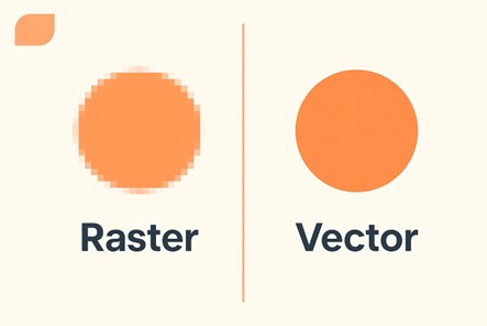
They are made up of thousands - or even millions - of tiny squares called pixels. Each pixel has its own color. Zoom in far enough, and you’ll start to see those little blocks—this is pixelation. It’s why a small photo looks grainy when you blow it up too much.
Vectors use math to describe shapes, lines, and colors. Instead of storing information pixel by pixel, they store the instructions for drawing the image. That means you can scale them up or down to any size without losing quality.
Now that we know the main difference between the two, let’s look at how they compare when it comes to logo design.
They are great for certain things, like
But there’s a problem: raster images have a fixed resolution.
Once you try to make them larger than their original size, the quality starts to drop. That’s when you get the dreaded blur or pixelation.
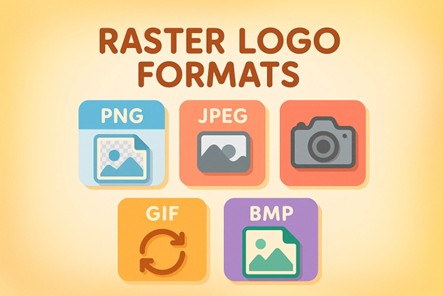
Supported File Formats
| File Extension | File Type |
|---|---|
| .png | Portable Network Graphics |
| .jpeg or .jpg | Joint Photographic Experts Group |
| .gif | Graphics Interchange Format |
| .bmp | Bitmap |
| .tiff | Tagged Image File Format |
These are great for:
Vector logos don’t lose quality when scaled. You can make them as small as a coin or as big as a billboard, and they’ll still look sharp.
Supported File Formats
| File Extension | File Type |
|---|---|
| .ai | Adobe Illustrator File |
| .svg | Scalable Vector Graphics |
| .eps | Encapsulated PostScript |
| .ps | PostScript |
| .emf | Enhanced MetaFile |
Since vector graphics are resolution-independent, your logo will look crisp on a business card or a 20-foot banner without any pixelation.
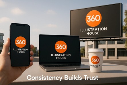
The best part? They help maintain consistency across all platforms and sizes.
Even organizations like the ACC (Atlantic Coast Conference) rely on vector logos to maintain brand consistency on everything from digital platforms to player jerseys.
That’s why in the raster vs vector debate, vectors almost always win for brand marks. They give you maximum flexibility to scale without sacrificing clarity.
Next, let’s dig into why scalability isn’t just a design perk anymore, but a must-have in 2025.
In the past, a logo mostly lived on business cards, shop signs, and maybe some print ads. But in 2025, things look very different. Your business logo design might appear on:
If your logo can’t handle all those different sizes without losing quality, it’s more than just a design issue; it’s a brand trust issue. People often judge the professionalism of a business based on small visual details, and a blurry or stretched logo can create the wrong impression fast.
Scalability has also been proven to affect performance. For example, when the Co-operative Group in the UK used a consistent logo across all its stores, the stores in the trial saw a 15% sales increase, much higher than the other stores at that time. This shows how a logo that works everywhere can really boost a brand.
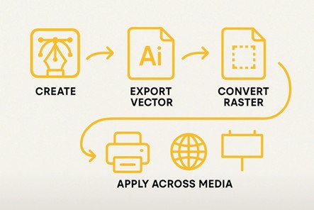
The easiest way to avoid pixelation disasters is to start with both formats from day one. When you hire logo design services , always ask for your final files in both vector and raster versions. That way, you’re covered no matter where your logo appears.
Here’s the breakdown:
Many custom logo design agencies already include both in their final handover. Even large publishing houses, event organizers, and marketing teams require vector files for their branding kits, because it’s the only way to guarantee their visuals will stay sharp across every medium.
Having both versions also makes life easier for printers, web developers, and sign makers. Instead of scrambling for the “right” file at the last minute, you’ll always have it ready.
If you’ve ever had to remake a logo because the original file was too small, you know how annoying and costly that can be. With vector files, this problem is solved. One vector file can be used for any platform or size without needing to pay for multiple redesigns.
This isn't just for small businesses; big companies like Coca-Cola use vector files for their logos, too. This way, they can print their logo perfectly on everything, from bottle caps to huge stadium signs. Vectors are great because they can be resized without losing quality.
Vector files also make teamwork easier. Printers, web designers, ad agencies, and sign makers can all use the same high-quality file without worrying about resolution problems. Plus, consistent branding has been shown to boost sales by up to 33% . So, the savings in time are good, but the real benefit is the growth it can bring to your business.
Even though vectors are great for most logos, raster images still have their use. Sometimes, they’re the better option, especially for certain types of visuals.
Raster images are best for things like detailed textures, gradients, and photos. Vectors can’t always capture these details as well. That's why raster is used for:
For example, a luxury fashion brand might post a close-up of fabric on Instagram, or a restaurant might share a high-quality photo of its signature dish. These visuals need the detailed pixel work that raster images provide.
The trick is knowing when to use each type. Keep vectors for your main brand assets, like your professional logo design , and use raster images for things like storytelling, photos, and campaign graphics. This way, you can make the most of both formats.
Consistency isn't just about colors and fonts; it’s about sharp, professional visuals across all platforms. A logo that looks blurry in some settings can erode trust over time.
The numbers back this up. Research shows that 85% of brands have brand guidelines, but only 30% actually stick to them . This leads to visuals that don’t match and quality differences across platforms.
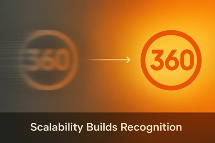
This is where understanding vector vs raster logo formats becomes important. Using a vector for your main brand assets means your logo will look the same everywhere, on a smartphone, a laptop, a storefront sign, or a billboard. That kind of visual consistency makes your brand easier to recognize, and recognition is the first step toward trust.
Once you understand the difference between vector vs raster logo, the next step is making sure your designer delivers exactly what you need, right from the start. This saves you time, money, and a lot of back-and-forth later.
Here’s what to keep in mind:
Even if you can’t open AI, EPS, or SVG files on your own, keep them safe. They’re your master source for any future scaling or edits.
Having ready-to-use PNGs or JPEGs for web, social media, and print means you’re always prepared.
Use CMYK for print and RGB for digital. A mismatch here can cause your colors to look different across media.
Store your files in clearly labeled folders so you (or your team) can find them instantly.
Even major logo design companies follow this workflow to avoid mistakes and maintain brand consistency. If it works for global brands like Coca-Cola or Adidas, it will work for you too.
By now, it’s clear that the vector vs raster logo choice is a branding decision that affects how your business is seen everywhere it appears. A sharp, scalable logo communicates professionalism and builds trust. A blurry, pixelated one can send the opposite message in seconds.
Nowadays, your logo isn’t limited to a single platform. It could appear on a tiny phone screen in the morning, on packaging by afternoon, and on a massive event banner at night. A vector logo gives you the freedom to scale up or down without losing quality, while raster files are perfect for quick, fixed-size use. Both have their place, but starting with a vector ensures your brand is ready for anything.
The smartest move is to work with designers who understand both formats and will give you a complete logo package from the start. Keep your master vector file safe, use raster versions for everyday sharing, and your brand will always look its best, whether it’s the size of a stamp or the side of a building.
Because first impressions matter - and your logo is one you’ll make every single day.
Looking for more information? Call us at +1 (855) 521-5040 for quick support!


Have a project in mind? Reach out to us, and we’ll help turn your ideas into stunning illustrations.
Tell us what you need, and we’ll create a custom illustration just for you. Reach out today and let's get started!

Copyright © 2026 360 Illustration House | All rights reserved. Terms And Conditions | Privacy Policy | Refund Policy
